Unit 69 - Drawing Concept Art for Computer Games
Thursday, 24 November 2016
HA3 Task 5 - Evaluation
Overall i have enjoyed this exercise because i have found the areas of art i am better at and like. The character was the area i felt most involved in i like stories with complex characters that utilise a character's skills and involvement on a story. Here i have found i am very good at character building. Whereas in comparison to environment i wasn't interested and neglected the side of art which to be honest i left till last minute. To conclude i need to use more techniques for environments like two point perspective and many more to make my characters setting more believable for a video game.
HA3 Task 3 - Final Illustration Presentation
Character
This is the last stage of my character i chose to make my character like one of Jim Henson's Muppets because i took inspiration from Happytime Murders which is a fan made film in currently in production that is also inspired by Jim Henson. Furthermore i thought it gave the character a lighter tone in contrast to the depressing time setting of the 1940s when countries were at war and the black cinema gave into peoples worries and unhappy moods, films of that time were called "Noir" which in french means black. So i went for a similar setting "Mitch" was a prideful young man wanting to help people but as time pasted at the world got to him and he losted his way now he is serious and cold with a dry sarcastic humour who secretly wants to be the hero again but is scared of the repercussions. This was the short story and list of emotions i wanted to give my character, so to convey this on to page i gave him a dry look by lowering his eyelids and frowning his eyebrows along with creases of skin on the top of his head as if he did this facial expression alot and said "are you serious?" I could'nt settle on the colour of his skin so i did two one with blue and the other with brown. The blue further expressed his cold emotion but the light brown made him look Cuban and i like that because it makes me think his voice is deep and croaky,
Equipment
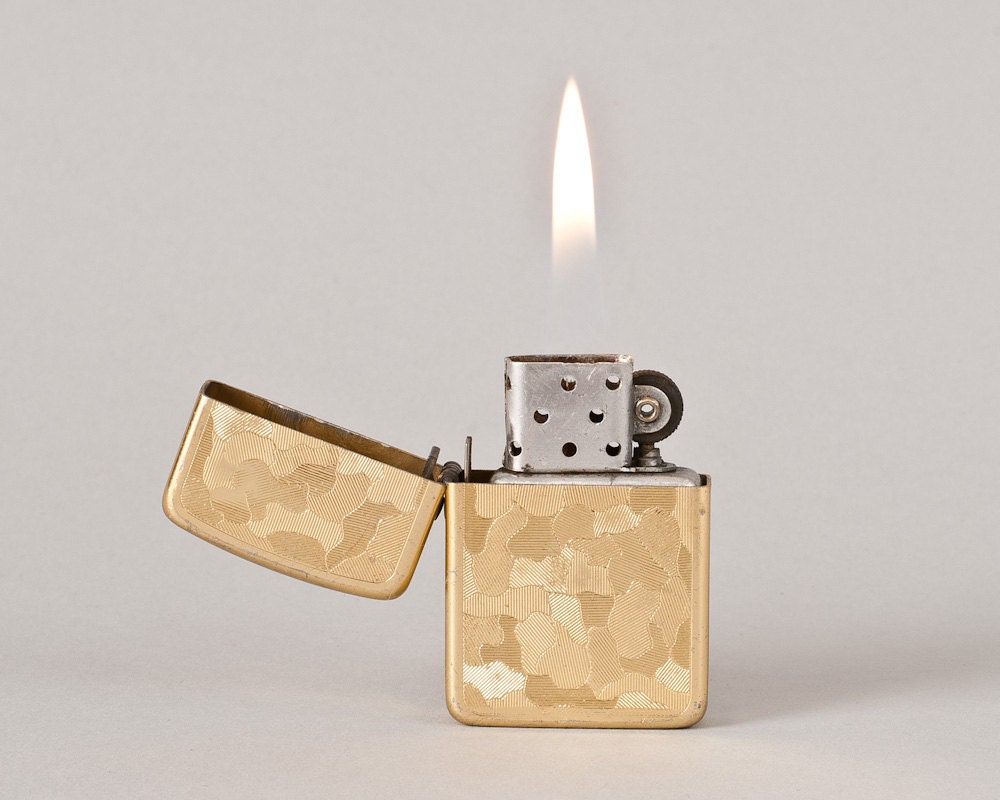
For the equipment i wanted it to be as historically accurate to the time and similar to the character for example people who meet you for the first time, judge you and determine what type of person you are by the clothes you wear and accessories you have. This is why i chose guns from the 1940s. In the brief it was written that the character "Mitch" has a revolver but i thought this made the character like a cowboy in my direction with the character he took pride in what he did but know he serious, cold and depressed so the image of him holding a revolver reminds me of john wayne and clint eastwood the heroes of westerns. I chose a Walther PPK. this gun is mainly associated with James Bond now this character is also the hero but his means of stopping the bad guy is ethically questionable and i like to think that Mitch is similar. I also chose a luger with a Narzi swastika engraved on it to give indications to the viewer who the bad guy is although in the brief it is said American soldiers bring back a nasty disease from japan, but i always like to think that there is something bigger to the story. Finally the cigarettes are based from a pack of Lucky Strike cigarettes which was the most popular brand at the time, accompanied by a gold zippo lighter to give the character a bit more class.
Environment
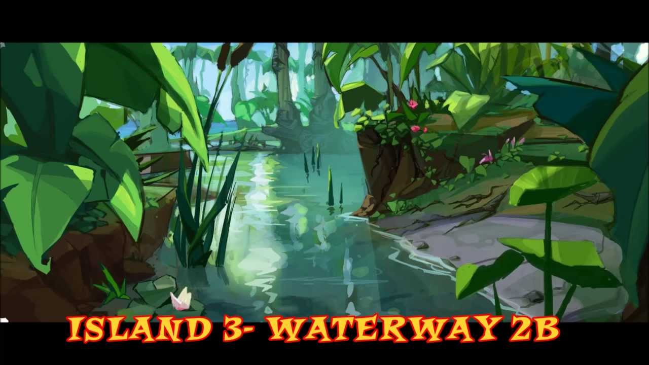
To be honest i spent a lot of time of the character and neglected the environment so i did the inside of the hospital more specifically the empty rooms as and hospital walls like a prison because the virus is being contained. Here i could of done better.
Monday, 14 November 2016
HA2 - Concept Art Process
Exploration
This is when artist start to express their ideas on page and is normally nothing like to final finish and most do not get used. Here is the early stages of the PlayStation 2 mascot Crash Bandicoot. He looks more like the Tasmanian Devil from Loony Toons compared to his final stage. The environment in the picture below shows icy mountains and snow terrain where as the final stage was actually a tropical island. This show that the exploration stage is nothing like the final product but is a great start to make ideas.


Approval
In this stage the artist, lead artists and studio have agreed on the characters look and the publisher has given the project a green light and the next stage is promotion. here the artist has framed his work.

Promotion
Promotional art is to further or encourage the progress or existence of the game idea. Now its the final finish they can commercial show it to the public. An example is E3 (electronic entertainment expo) this is a event where video games can be presented. The publishers will also distribute merchandise to furthermore strengthen the campaign before the games release.
This is when artist start to express their ideas on page and is normally nothing like to final finish and most do not get used. Here is the early stages of the PlayStation 2 mascot Crash Bandicoot. He looks more like the Tasmanian Devil from Loony Toons compared to his final stage. The environment in the picture below shows icy mountains and snow terrain where as the final stage was actually a tropical island. This show that the exploration stage is nothing like the final product but is a great start to make ideas.

Approval
In this stage the artist, lead artists and studio have agreed on the characters look and the publisher has given the project a green light and the next stage is promotion. here the artist has framed his work.

Promotion
Promotional art is to further or encourage the progress or existence of the game idea. Now its the final finish they can commercial show it to the public. An example is E3 (electronic entertainment expo) this is a event where video games can be presented. The publishers will also distribute merchandise to furthermore strengthen the campaign before the games release.

HA3 Task 1 - Reference Research
Sources:
https://en.wikipedia.org/wiki/File:CrashBandicootLogo.png
http://henson-alternative.wikia.com/wiki/Happytime_Murders
http://www.imdb.com/title/tt1308728/
http://ottawa.ca/en/1870s-1940s
http://gadreel-the-angel.tumblr.com/post/86610143033/gardenofmourning-1940s-au-dean-winchester-and
Friday, 16 September 2016
HA1 Task 1 - Mark-making Portfolio
Anatomy
These
exercises are designed to warm you up and start drawing more freely from what
is directly in front of you. In addition, the idea is for you to experiment
with the techniques and media you are introduced to and not worry too much
about the outcome.
1. Full
Face
Paper:
portrait
Media: biro
Time: 4
minutes
Left-handed
(or right, if left-handed)
Instruction:
Top of head/hair must
touch the top edge of the paper, the chin the bottom and the ears each side.
Draw loosely and freely adding as much detail as possible.
2. Cheesey
Smile
Paper:
landscape
Media: biro
Time: 4
minutes
Usual
drawing hand
Instruction:
Smiling mouth to
stretch from left to right-hand side of paper. The rest of the features to fill
within the page.
3. Don't
Stop
Paper:
portrait
Media:
coloured marker pen – any colour
Time: 5
minutes
Usual
drawing hand
Instruction:
Draw a full face
portrait that fills the page, but you may not take the pen off the paper at any
point.
4.
Blind-folded
Paper:
portrait
Media:
coloured marker pen – any colour
Usual
drawing hand
Instruction:
Stare at your subject
intently and draw a full face portrait. Do not look at the paper until the time
is up.Exercise 2 - Secondary Observation Self-portraits
Six Selfie-portraits
Take a range of selfies, exploring the expressions below. Choose six, the strongest for each of the expressions.
Divide an A3 sheet into six panels and make a pencil drawing from each selfie, taking approximately 15 minutes.
Start by loosely sketching in the composition within each panel and then start to work on the tonal range of the image, establishing the lightest to darkest areas. The order and orientation is up to you, but use an additional piece of paper to protect the drawing so that you don’t smudge your work.
Include your original source images when presenting the work on your blog.
In this picture I created six boxes in these boxes I did self portraits, I didn't mind that the task had a lot on creative design instead of a construct picture and what I've taken from this task is that I need to fill the page more.
Six Selfie-portraits
Use the YouTube tutorial here to draw the two Manga-styled heads representing joy and embarrassment on an A3 sheet.
Publish your work to your Unit 69 blog following the layout on the example blog.
Publish your work to your Unit 69 blog following the layout on the example blog.
In this picture I watched a YouTube tutorial which I found easy to follow and I managed to make the drawing closely resemble the original. This exercise was challenging and I think I found it to be a good start in building up a better skill in drawing.
Exercise Number 4 - Gridded and Scaled Parkour Drawing
Using
the reference image from a Parkour App character, use the
gridding technique to transfer the smaller A4 photographic image to the larger
A2 gridded plain paper.
I aimed to convert the photograph into a simpler illustration. I
taken each square at a time and I simply drawn the picture by square. I gave a lot of attention to the face because it was the main foreground then the second figure I added lesser detail because he was in the background but the text I kept bold so the viewer can read it. When the image was drafted out I used shading and coloured pencils to add my own creative touch to the image, I really liked drawing from construction and gridded scaled drawings because I'm not very good at drawing proportion of images and this task helped improve my drawing skills.
Exercise Number 5 - Template Mythical Creature Drawing
Start
by using a graphite pencil to transfer and scale the main elements, then colour
up the drawing using coloured pencils and complete it with a fine liner (be
careful not to simply draw around every line again, be selective. Use the paper
effectively to create an interesting composition.
This method of drawing was a fun and creative experiment and a task I liked, this has been the most creative task out of the five. I think drawing from template is an advantage when creating characters for video games. I took inspiration from animals and comic books the head being from Hellboy and the arm taken from cyborg (DC Comics) the rest of the body is from spiders, camels and the torso is a scorpion.
Exercise Number 6 - Expressive Hands Drawing
Divide
an A3 sheet into four panels and make a pencil drawing directly from your hand.
This is designed to be expressive and so start by loosely sketching and blocking in the composition within each panel and then start to work on the
tonal range and detail of the image, establishing the lightest to darkest
areas.
I found this method pretty hard compared to the others because it was primary research, i understand i must work harder on this method because its my weak point.
Exercise Number 7 - Figure Movement Sequence Drawing
Using
the props provided carry out a photo-shoot in the studio of you using a sword
and shield to step, block and then lunge. The DSLR camera will be set on
multi-shot mode and will capture the movements you make in a series of
photographs.

Exercise Number 8 - Silhouette Figure Drawing
Using
a series of dark felt pens, produce a series of 8 figure drawings observed from
life that study the pose of the model, but only draw the negative space around
the figure (NOT AN OUTLINE), leaving a silhouette. Work loosely, but carefully.
Perspective
Exercise Number 1 - Isometric, One, Two and Three Point Perspective Introduction
Isometric Perspective Projection,
Two-point Perspective Projection,
Three-point Perspective Projection
Exercise Number 2 - 2-point perspective Background - Space station video (links to an external site.)
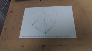
Exercise Number 3 - crating introduction
Exercise Number 4 - crating application - pistol
Colour
Exercise Number 1 - colour introduction
Ideas Generation
Exercise Number 1 - alternative uses for clothes pegs
Visual Communication
Exercise Number 1 - how to guide
Create
a guide that explains an activity using only images and symbols – NO WORDS. You
will need to use the internet to research your chosen activity, both the
process and visual aids. Use an A3 sheet to layout your sequence of images. Plan
and sketch out your sequence in pencil and then outline it using a biro or
fine liner (and coloured pencils or pens if you wish).
Objects
Exercise Number 1 - Tonal Paper Studies
Using the supplied rolls of paper create still life environments and produce a series of four, close-up tonal observational studies of paper constructions using pencil in response to the following themes:
Tied
Twisted
Folded
Curled
I found this method really helpful to draw as I could hold the object and get a feel for the structure and hopefully recreate it on paper. I will use this method in the future to maybe create a game level or world with Lego or other types of equipment.
I found this method really helpful to draw as I could hold the object and get a feel for the structure and hopefully recreate it on paper. I will use this method in the future to maybe create a game level or world with Lego or other types of equipment.
Textures
Exercise Number 1 - Willow Charcoal, Soft and Oil Pastels
I am are going to draw a series of 9 textures (closely observed abstracted sections of surfaces) from around the college site, three using soft pastels, three using oil pastels and three using willow charcoal. Fold 1 A3 sheet of cartridge paper into 9 to use as your canvas. This was a interesting experience because of the range of drawing equipment we had to use.
Subscribe to:
Comments (Atom)


